

NYT Cooking: Compliance Update
Cooking and compliance are two areas I'm truly passionate about. After using the NYT Cooking app regularly, I noticed some areas that could be adjusted to be more compliant. In my spare time, I worked on redesigning the landing page of the app to enhance accessibility and create a more inclusive digital experience for all users.
Updated design:
Original design:


-
Added a card container with a drop shadow, this makes it easier for users to identify that the content is interactive.
Altered titles to title case, as research shows that text in all caps takes longer for users to read.
Included more inclusive language by changing “recently viewed” to “recently visited”.
To ensure the “Recently Visited” section is ADA compliant, I’ve added a horizontal scroll bar to clearly indicate that additional items can be accessed by scrolling.
-
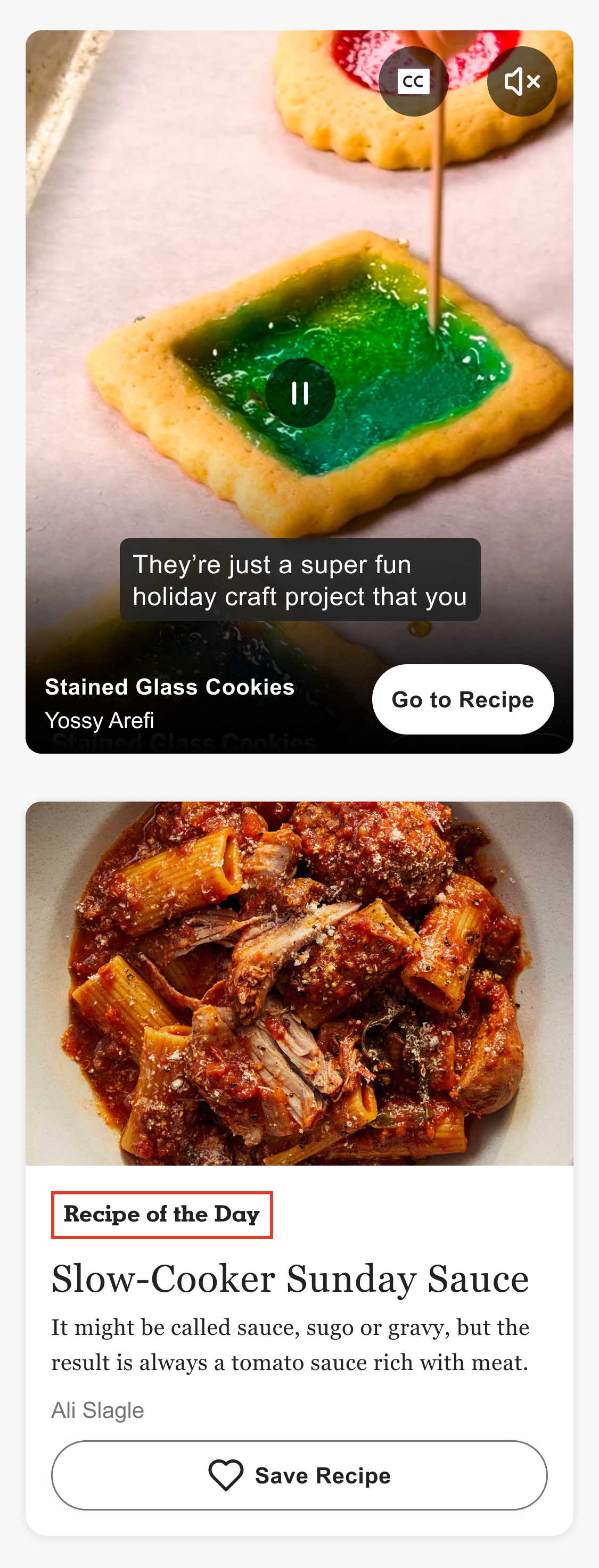
I added a pause button to clearly indicate to users that the video can be paused.
While the closed captioning and sound buttons met the minimum size for ADA compliance, I took it a step further by increasing their size to 44px for improved usability. Additionally, I adjusted the spacing between the buttons to ensure they meet WCAG guidelines, which require a minimum 24px distance between tappable areas.
-
The current website fails simple color contrast for the unselected state text. Additionally, to be fully compliant, selected items must have two visual indicators to clearly differentiate them from unselected items.
To improve this, I bolded both the text and icon for the selected navigation item and adjusted the icon color. (Icons only need a 3:1 contrast ratio to meet accessibility standards.) For the unselected state, the text and icon are not bolded, and the icon color is set to black.
-
Updated the logo to match the branded site (note: logos are exempt from color contrast compliance).
The background color was changed to a tan/gray tone to better reflect the brand’s aesthetic.
I also refined the navigation iconography and copy. I introduced modern icons that users are more likely to recognize, such as a home icon for the main page and a heart icon for saved recipes. Additionally, I swapped “Browse” for “Home,” as that’s the most frequently visited page, and changed “Recipe Box” to “Saved,” which is a more familiar term for users.
Updated design:
Original design:

I adjusted the button height to 44px, which is the recommended size for tappable buttons to improve usability.
To enhance readability, I filled the buttons, making the text more legible.
I altered the button copy to be more inclusive.
The save button was moved below the recipe rather than placed within the image. This change ensures that screen readers can read the content in order, making it clearer for users which recipe they are saving.
Lastly, I updated the "Recipe of the Day" color to meet accessibility standards, as the original red-on-white combination didn’t pass color contrast. I added a red border around the text to maintain the branding while ensuring compliance.
Original design:

Updated design:
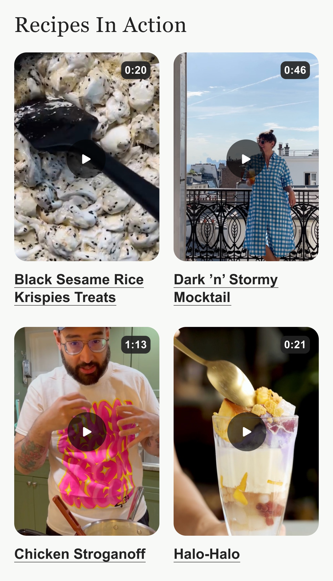
ADA guidelines require videos (and even micro-animations) that autoplay for more than 5 seconds to have a visible pause button. I modified the video behavior in the “Recipes In Action” section so that users must click to play the video instead of having it autoplay.
I also added hyperlinks to the "Recipes In Action" section, as it makes it more obvious to the user that these are clickable links.
Updated design:
Original design:
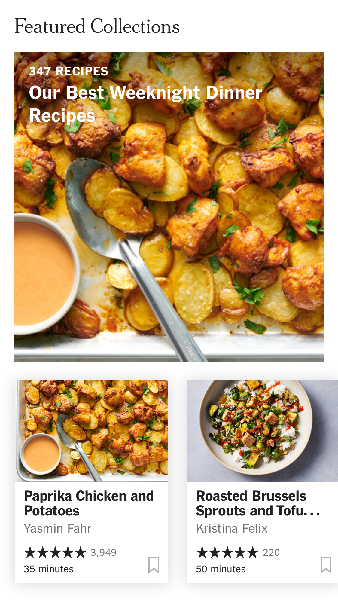
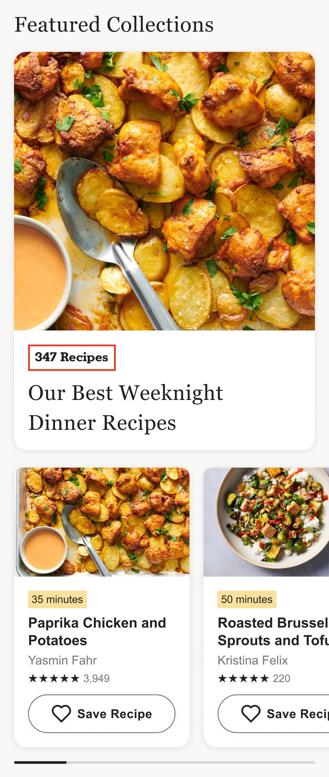
The text on the “Our Best Weeknight Dinner Recipes” image lacks sufficient contrast for compliance. To remedy this, I moved the copy below the image and used a red outline to highlight the number of recipes featured, improving both legibility and accessibility while pulling through branding.
I repositioned the cook time above each recipe name and placed it in a branded container. This makes it easier for users to quickly scan and find recipes with shorter cook times.
The save button was updated, as the current gray bookmark color (Hex #B3B3B3) does not meet contrast standards.
I redesigned the save button to be more prominent and user-friendly, ensuring it’s clearly recognizable. Additionally, I added descriptive copy for screen readers, eliminating the need for alt text coding.