
Component Library
I led the creation of a component library for our client’s patient web enrollment experience—spanning numerous brands—to help efficiently design new branded sites. While some pages were unique per brand, most followed a template that we reused throughout each enrollment. With this library, we are able to easily grab unbranded components to tailor them to each newly branded experience.

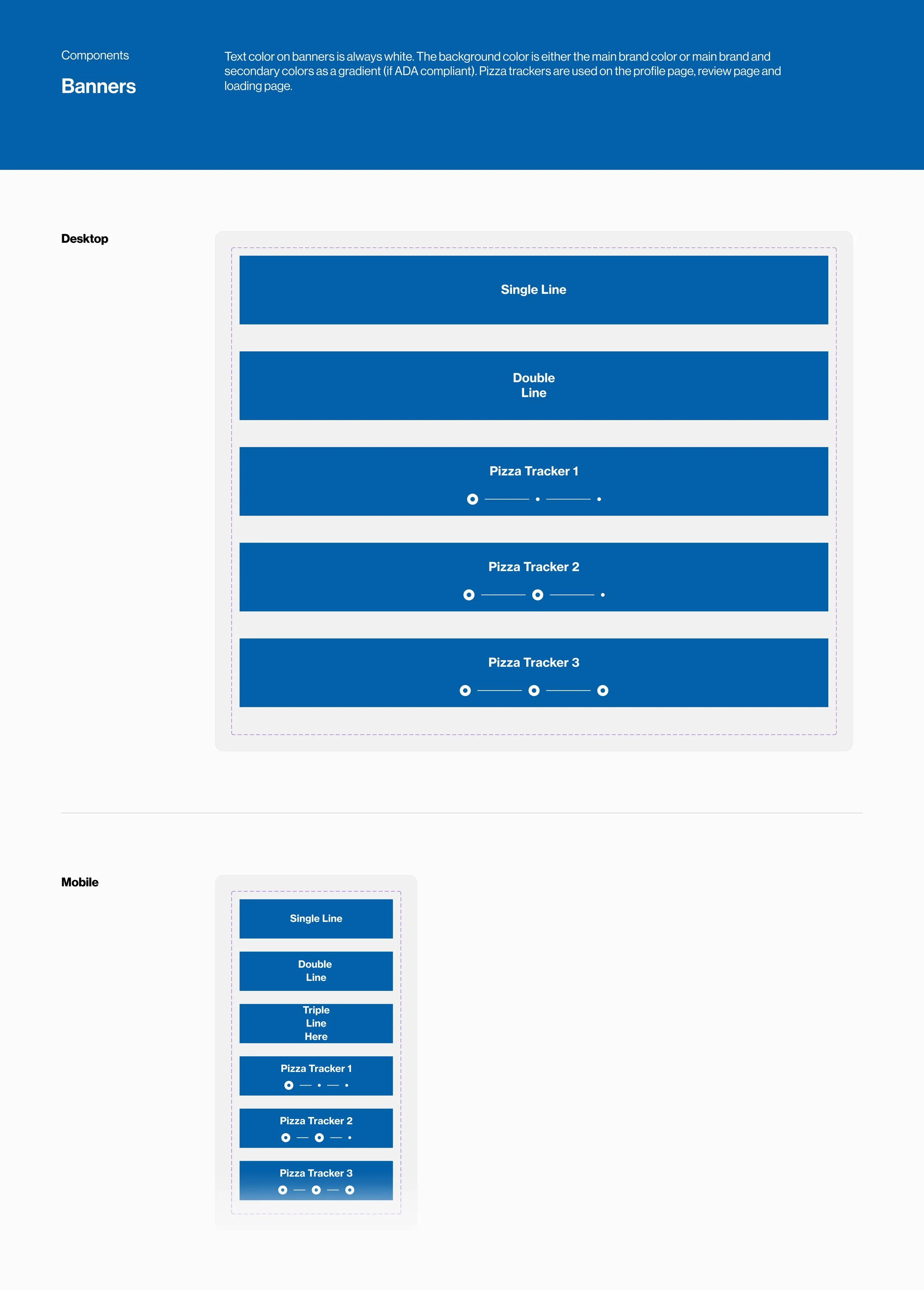


We utilized numerous features in Figma to create an easy to use library:
Variants
We created variants throughout to provide a quick toggle between the different component versions (i.e. unselected buttons, selected buttons, hover state buttons)
Boolean Properties
We added boolean variables to give flexibility to components that could differ per brand (i.e. an icon can be turned on or off in the same button component)
Auto-Layout
We set height and width constraints, allowing users to grab a component block without breaking conventions (spacing was set to developers specifications and for responsive design)
Variable Colors
We created placeholder variable colors to easily pull through each brand’s color palette (i.e. primary color, secondary color, button color, text color...etc.)